Thursday, December 28, 2006

My new favorite BG
Dimension: 178 x 220
Tired of available and boring BGs in the Motorola V3 Pink, then i decided to designed a BG for myself. The main idea is to perform the 56,000 colors screen of my mobile. So, here it comes the colorful image (colorful squares with white strokes) as my major style for this semester ^_^.

Tuesday, December 26, 2006


Body Paintings
by Dungism
It was in a party with friends. I found a black pen and start "designing" some graphics right on my friends' hands. I did not have a layout first but created it straight away. Ideas about lines, curves appear along while i was painting.
The first one: Qùynh; my friend's name
The second one: Loan; my friend's name
The third one: simply lines, dots and curves.

Sunday, December 24, 2006


Above, there are two logos i have designed for my brother. They are two different styles; one is a bit traditional i guess with the representation of a small island, a coconut tree and a couple of buildings (hotels). The other one is kind of neat and modern better than the previous one. But i still think they are not good enough...I'll try for some more.

Friday, December 22, 2006

Photo by Nguyen, Tran Cao
Edited by Dungism
Does this image raise some feeling from you? Yes, it does for me.
The origial one is in color but i wanted to make less colorful by increasing the darkness and contrast level of it. So that, you are now seeing it in only black and white and a bit green from the tree out side the window. The model's body seems to be merged in to the shadow of the window.
The mood is empty, lonely, mysterious and somehow independent...

Sunday, December 17, 2006


"This is what left..." is the name of my most recent social welfare poster design. This is a bout anti-gambling, once again, my favorite style and tool work well together i think ^^. I specially like this one. I have actually researched to find down how to say the fact and how to break it. Look at this, main moods can be realised are funny and ironic.

Well, first time with Grid... how do you feel about this image? This is the one main component, it can rotate at 90, 180 and 270 degree and get together creating a grid.. Not very special, i have designed by playing around with colors and brush tool in Illustrator ( ofcourse...my favorite tool ^^)

Saturday, December 09, 2006

Well…after almost one week, finally I’ve made this image. The idea comes suddenly when I started looking for some thing which is absolutely simple but not simple at all :P. For this design, as its designer, I want its meaning to be explored as “fresh” more than “fresh” itself. From the side of viewing, I intend to make the viewer be able to “read” the contents inside without being told too much. Ah! One more thing, this is designed following the idea of a poster from which people are given information about some particular issues happening in the society. For this, I have had the idea from the river in front of my house...extremely polluted…This might be the main idea for my next assignment. ^^
The image of a water dot put right at the middle of a white background is really simple but it is also easy to recognize the feeling of clean, neat and fresh here. Normally, people do not waste too much time to look at something which is “too much” to read. So, why not an image knows how to speak by itself…I’m trying my best to design something following this concept (>”<)


Do you recognise any similarity between these two images? I guess "no" because obviously they look totally different. However, as i design the second one, it was actually based on the first one; what i really look like. The only one element you can realise in similarity is blue color and the rest is completely abstract.
I decided to design it with perspectives mainly and all the components seem to be floating in such a virtual environment. The lines connecting between my "processors" ain't stable or straight but look kind of sensitive. Every part is arranged as if they are not neat but complicated just like what happening within my mind. Take a look at my "head" (the monitor) there are memories kept as films overlaying each others and they are all very precious to me...see the light surrounding? The On\Off button represents for my heart, it shortly means that "Don't hurt my heart or i'll die" ^_^, seem like i'm a very sensitive person.
I'm actually afraid of water especially the vast ocean so that i chose the background of water dots. I really want to perform my situation that i always have fearness surronding me. And, my life become a bit harder than normal, my real person is covered below a mask but hardly ever people around me can see that...
Altogether, the portrait showing some sense of complicated, sensitive and isolated (actively).

Sunday, December 03, 2006


The 1st version:
...did i do anything to my brother?...i guess not, i've just arranged the text, font and size...And, finally, put a small piece of decoration surrounding the client's name. I thought i would look less empty than without it.
The 2nd version:
I realise how long and hard the logo took the designer to design it, so i think, i can not change the background to black to fit the whole black background. So, i decided not to change it, so, another idea came along. I finally divide the card into 2 sections with 2 different colors absolutely contrast; black and white. The logo and contact details i think should be at one side together and the client name than stand alone on the other side. So, it may make the balance in the level of importance between the guy nam or the company's logo...

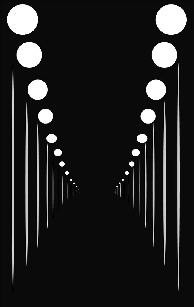
"Ain't no head lights on the road tonight?..."
Above is one of the sentences from the song "The last goodbye" by Automic Kitten. You might wonder why i've put it here...because, it was actually the starting point for me to create this piece of design in Illustrator.
All i have done with this was making a black background and use the tool to draw different ovals from different sizes and shapes than arranging them perspectively following an "off the top of the head" idea when i listen to this song.
Does this picture remind or make some sense for you? For me, yes it does a lot. I've been listened and inmagined for uncountable number of songs. Each song i've heard without seeing the movie clip, each specific inmagination i have had in my mind. For this is a very specific instance. The design did actually give me the feeling of emptiness...a sense of being lonely but just dont know the reason for it. Then...deciding to go, go and keep going on to reach some thing that you might not even know what it is and when will it come. Uhm, well, it might seem to be too romantic for now i think :))