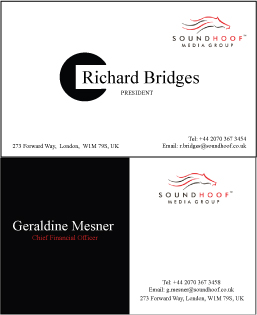
...did i do anything to my brother?...i guess not, i've just arranged the text, font and size...And, finally, put a small piece of decoration surrounding the client's name. I thought i would look less empty than without it.
The 2nd version:
I realise how long and hard the logo took the designer to design it, so i think, i can not change the background to black to fit the whole black background. So, i decided not to change it, so, another idea came along. I finally divide the card into 2 sections with 2 different colors absolutely contrast; black and white. The logo and contact details i think should be at one side together and the client name than stand alone on the other side. So, it may make the balance in the level of importance between the guy nam or the company's logo...


0 Comments:
Post a Comment
<< Home