Saturday, January 13, 2007

Another logo for my brother...
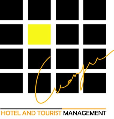
For this logo, my idea is to create a warm atmosphere when people looking at it. The several little squares are like windows from a building (like hotel,motel or restaurant...). There is also a lightened window placed nearly in the middle. Is it too abstract to be recognised? The signature will be taken from my brother's real one.
I'm not very sure. As going deeper and deeper in designing a logo, i find out that this is a really hard job and requires a long time to accomplish what we want to show with in a small logo.
CARNIVAL OF SOULS
This image for my final project based on the movie Carnival of souls. The idea of this is to create a vast and empty atmosphere with the shadow of the main actress standing in such quiet area.
The film is quite horror but it did not scare me a lot due to the early techniques, however, what is good about this film must be its art theme, the way they made the settings and caught such suprisingly scenes. I think they are really effective. This director should have been one of the founder for the later horror movie filming.
Do you think black and white work together well in this situation? Recognising the two lines? Those two lines set up the setting for this picture, the one above represents for the horizontal line and the one beloew represents for the small island on which she is standing( this also appears in the movie).

Saturday, January 06, 2007

3D by Illustrator ...
an endless hole with some red ribbons at the beginning...
In my mind, red and black are always the scariest colors; the black create the feeling of "unknown","invisible","empty" and even "horribly lonely", the red is something so strong, a bit horrible as blood. The compination of these two does make me real afraid and in me, there are feelings of unpredictable, very terrible, very cruel.
Ok! Enough for the idea, about how to do this, to make it look like 3D image, besides the gradient color designing shadow and light, i have also drawn some red ribbons by brush with different sizes arranged at different position to create the look of perspective. That's all.

Thursday, January 04, 2007


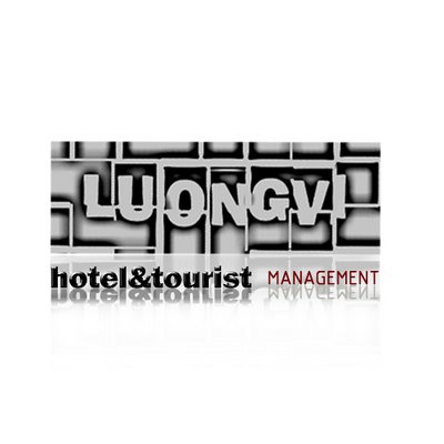
At first, i decided to create a new logo version for my brother. However, after a while, it becomes like this. I really think that this can not be a logo, so, i did not sent it to my brother. This can only be a piece of ads or something like that.
On the other hand, let's look at some nice aspect happening in this image that i like. Firstly, the banner with my brother's name "LuongVi" was edited in Photoshop with the mix of some filter styles. The way the words are broken and look a bit old; i really love it. There is also something below; the pure shadow from the line "Hotel and Tourism Management"(oops, i did make a spelling mistake T_T). Anyway, i like that kind of shadow.